An effective frontend developer portfolio design is more than just a visual showcase—it highlights your technical abilities and creativity. Follow these tips to design a portfolio that stands out in the competitive world of frontend development.
Why Frontend Developer Portfolio Design Matters
Your portfolio is often the first impression potential employers or clients have of your skills. Thoughtful design choices—such as typography, layout, and color scheme—should reflect your proficiency in creating user-friendly, visually appealing websites.
For practical tips on how to structure your portfolio, check out our guide on Web Developer Portfolio Structure.
Design a Frontend Developer Portfolio with Purpose
Before diving into the design, define the purpose of your frontend developer portfolio. This will guide your design decisions and content structure. Here are a few questions to help clarify your portfolio's direction:
- Who is your target audience? Employers, freelance clients, or collaborators?
- What key skills or technologies do you want to highlight?
Answering these questions ensures your portfolio reflects the right message and meets the needs of your audience.
SEO Tip: Focus on Audience-Targeted Keywords
For better SEO, target keywords such as “frontend developer portfolio,” “web developer portfolio,” and “portfolio for freelance developers” to attract your ideal audience.
Typography: Set the Right Tone
Typography is crucial in setting the tone of your frontend developer portfolio. The right fonts can create a professional yet approachable feel, signaling your design skills.
Where to Find Fonts for Your Frontend Developer Portfolio:
Choosing the right font helps define the atmosphere of your portfolio. For example, Atma is playful and engaging, while Roboto is clean and professional.
SEO Tip: Choose Readable Fonts for Better UX
Fonts should be legible and easy to read. Search engines prioritize user-friendly sites, so focus on typography that enhances both design and accessibility.
Suggested Fonts for Frontend Developers:
- Inter

- Roboto

- Lato

- Poppins

Check out Best Fonts For Portfolio for more recommended fonts that are perfect for use in portfolios.
Color Scheme: Choosing the Right Colors for Your Portfolio
Color is a powerful tool in design, influencing mood and readability. Choosing the right colors for your frontend developer portfolio helps create a visually appealing and cohesive experience.
Understanding Complementary Colors:
Complementary colors increase contrast, making your portfolio more readable and visually striking.

How to Build a Color Scheme for Your Portfolio:
Start with a base color:
- Blue: Trust, professionalism
- Green: Growth, creativity
- Yellow: Optimism, energy
- Red: Passion, urgency
- Grey: Neutrality, balance
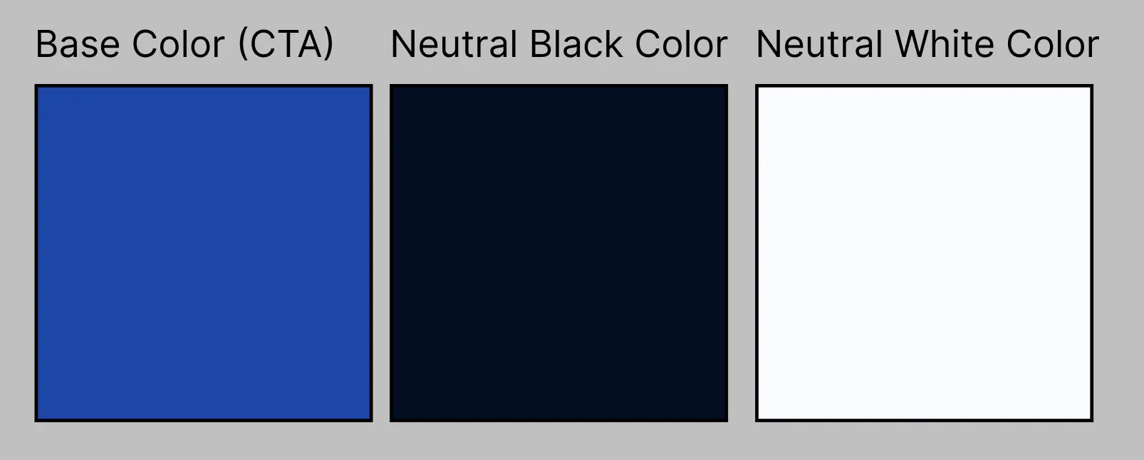
For a professional look, consider using blue (#0047AB) as your primary color. Use ColorHexa to find complementary color options.
Color Scheme Types:
- Monochromatic
- Analogous
- Complementary
- Triadic
For simplicity, consider a Monochromatic scheme using blue.
Neutral Colors:
Neutral colors are essential for text and backgrounds. Use variations for light or dark themes.

Applying Your Color Scheme:
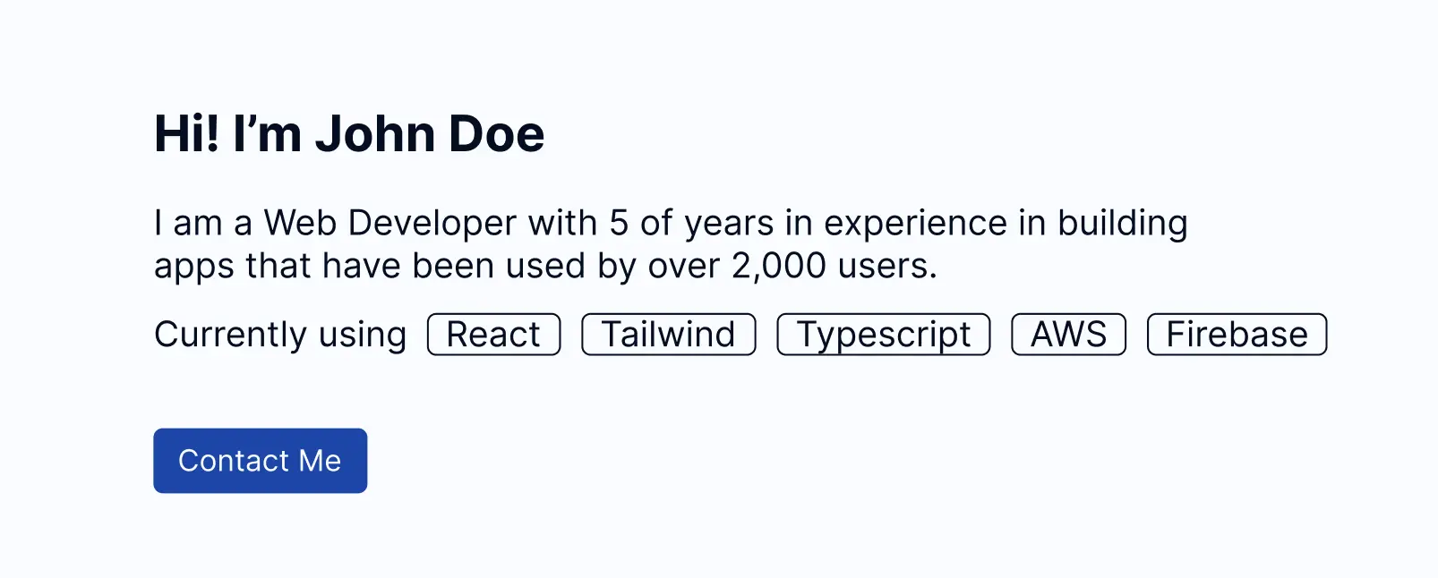
Here's an example of how your frontend developer portfolio homepage could look with a professional color scheme:

Inspiration: Find Designs for Your Portfolio
Looking for inspiration is a key part of the design process. Explore other portfolios to gather ideas that you can incorporate into your own.
- Dribbble – A great resource for frontend design inspiration.
- webportfolios.dev/portfolios – Browse community portfolios for creative ideas and layouts.
SEO Tip: Analyze High-Ranking Portfolio Designs
Review portfolios that perform well in search engine rankings to understand what works. Incorporate similar successful design elements while ensuring your portfolio stands out.
Conclusion
When designing your frontend developer portfolio, aim for a balance of functionality, aesthetics, and user experience. Ensure that your design communicates your technical skills while appealing to your target audience. Don’t forget to check out our Web Developer Portfolio Structure guide for more tips on creating a structured, professional portfolio.
By following these design tips and best practices, your frontend developer portfolio will not only stand out visually but will also be optimized for SEO, helping you attract more opportunities in the field of frontend development.